
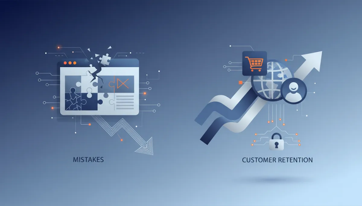
Avoid These 5 Website Mistakes to Retain Customers
Website Design, Customer Retention, Business Credibility, Technical Optimization
5 Website Mistakes That Make You Look Amateur and Quietly Drive Away Customers
Your website is the first serious test of your professionalism—most visitors decide in seconds whether to trust you, contact you, or click away to a competitor. When your site feels slow, dated, or confusing, you pay for it in lost leads, weaker pricing power, and shorter attention spans. The challenge is simple yet brutal—prospects rarely tell you that your website is the reason they left, they just disappear.
The Invisible Crisis: How Your Website Quietly Undermines Your Authority
Prospects rarely complain about bad digital experiences—they simply bounce, compare, and choose someone else. A site that feels even slightly amateur sends a clear signal about your operations, your attention to detail, and your ability to deliver. This is not just about aesthetics, it is about business credibility, customer retention, and perceived value. If your website underperforms, every marketing dollar you spend sends traffic into a leaky funnel you cannot see, but you absolutely feel in your pipeline and revenue.
The following five mistakes are the most common credibility killers on professional websites. Each one damages trust, erodes confidence, and makes it harder to convert qualified visitors into serious inquiries—no matter how strong your actual services may be. Addressing them requires discipline in website design, technical optimization, and clear messaging, but the payoff in trust and conversions is significant and measurable.
Mistake #1: Slow Loading Speeds That Test Patience and Signal Operational Weakness
A sluggish website is more than an annoyance—it is a direct hit to your perceived competence. In a world where users expect pages to load in under three seconds, anything beyond that feels careless. Slow speeds suggest outdated technology, poor maintenance, and a lack of respect for your visitor’s time. That impression bleeds into how they view your service delivery, responsiveness, and reliability. Even if your team is highly capable, your site’s performance tells a different story, and prospects believe what they experience, not what you claim.
From a customer retention standpoint, slow pages destroy engagement. Visitors abandon forms, fail to complete downloads, and never reach your high-value content. For returning users, repeated delays train them to expect friction, pushing them toward faster, more polished competitors. On the technical side, poor performance also damages search visibility, compounding the problem—fewer people find you, and those who do are more likely to leave quickly. This is a credibility, visibility, and conversion issue rolled into one.
The Speed Solution: Treat Performance as a Non‑Negotiable Standard
Start by running your site through reputable performance tools—PageSpeed Insights, GTmetrix, or WebPageTest. Do not skim the summary, study the specific issues dragging you down. Prioritize technical optimization steps that deliver the biggest gains, such as compressing and resizing images, deferring non‑critical scripts, enabling browser caching, and reducing the number of third‑party trackers. For many professional sites, image bloat and unnecessary plugins are responsible for the majority of delays and can be corrected without redesigning the entire platform.
Set a clear internal standard—your key pages should consistently load in under three seconds on typical connections. Monitor performance at least monthly, especially after adding new content, tools, or integrations. When speed becomes a disciplined habit rather than a one‑time project, your website starts reinforcing your reputation for efficiency instead of contradicting it. That consistency builds trust and keeps visitors engaged long enough to actually evaluate your offer.
Mistake #2: Mobile Experiences That Frustrate and Repel High‑Intent Visitors
For many businesses, more than 50% of website traffic now arrives on mobile devices—yet a surprising number of professional sites still treat mobile as an afterthought. When layouts break, buttons are too small, or forms are painful to complete on a phone, visitors do not assume a technical glitch, they assume disorganization. A clumsy mobile experience signals that your firm is not keeping pace with modern expectations, raising doubts about how you handle projects, communication, and client needs in other areas as well.
Poor mobile usability directly affects customer retention and lead quality. Busy decision‑makers often research vendors on their phones between meetings. If your site is difficult to navigate on a small screen, they will not patiently switch to a desktop later—they will move on to a competitor whose website respects their constraints. Every broken layout, overlapping element, or hard‑to‑tap link quietly communicates that your business is not designed around the customer’s reality, and that is a serious credibility problem.
The Mobile Solution: Design for Thumbs, Not Desktops
Evaluate your website on multiple real devices—different phones, tablets, and screen sizes, not just a responsive preview in your browser. Navigate as a prospect would: open the menu, complete a form, download a resource, and tap your primary calls‑to‑action. Anything that feels cramped, misaligned, or tedious must be treated as a priority fix. Focus your website design on clarity and touch‑friendly elements: large, well‑spaced buttons, readable typography, and simplified layouts that guide the eye rather than overwhelm it.
From a technical standpoint, ensure your site uses responsive design correctly, avoids intrusive pop‑ups on mobile, and leverages mobile‑optimized images and fonts. Test loading speed on mobile networks, not just high‑speed office connections. When your site feels effortless to use on a phone—fast, clear, and focused—you send a powerful message about how you operate as a business: attentive, organized, and aligned with how your customers actually work.
Mistake #3: Outdated Design That Broadcasts “Behind the Times” Before You Say a Word
Design is not decoration—it is a credibility filter. Visitors make rapid judgments about your professionalism based on color choices, typography, spacing, and imagery. When your website looks like it has not been touched in years, prospects conclude that your thinking, processes, and tools may be equally outdated. Stock photos that feel generic, cluttered layouts, and inconsistent branding all contribute to a quiet but powerful impression—you are not operating at a modern, professional standard, no matter how capable your team actually is.
Outdated design also harms customer retention. Returning visitors want reassurance that your business is active, evolving, and investing in improvement. A stale visual experience suggests stagnation, making it harder to maintain long‑term loyalty, especially when competitors present sharper, more current digital experiences. Design is one of the most visible expressions of your brand’s seriousness—when it lags, your business credibility suffers, even if your results do not.
The Design Solution: Modern, Minimal, and Ruthlessly Intentional
You do not need to chase every design trend, but you do need a site that feels current and intentional. Start with the fundamentals of strong website design: ample white space, a restrained color palette, clear visual hierarchy, and typography that balances readability with personality. Replace generic stock imagery with authentic visuals—real environments, real people, and real work wherever possible. Consistent branding across pages, from buttons to headings, reinforces reliability and attention to detail in the mind of your visitor.

A modern, focused interface instantly elevates perceived expertise and pricing power.
Periodically review your site against leading firms in your space—locally, nationally, and globally. If your design feels noticeably older or busier than the leaders you admire, that is a clear signal your digital presence is holding you back. A thoughtful refresh, guided by strategy rather than personal preference, can reposition your brand in the minds of prospects within days of launch, reinforcing your authority instead of quietly eroding it.
Mistake #4: Confusing Navigation That Turns Your Website into a Maze
Navigation is not just a menu—it is the structure of your story. When visitors cannot quickly find what they need, they do not assume the information is missing, they assume your business is disorganized. Overloaded menus, vague labels, and inconsistent page structures create cognitive friction that wears down even motivated prospects. If it takes effort to understand your website, visitors will assume it will take even more effort to work with you, and many will not bother to test that assumption.
From a customer retention perspective, confusing navigation is especially damaging for existing clients seeking resources, support, or documentation. When they cannot quickly locate what they need, frustration grows—and frustration is the enemy of loyalty. Internally, poor navigation also undermines marketing efforts, because valuable content remains buried, rarely seen by the right people at the right time. The net result is a website that feels bigger, yet delivers less value, weakening both trust and engagement.
The Navigation Solution: Clarity, Convention, and Customer‑First Structure
Effective navigation starts with ruthless simplification. Limit your top‑level menu to a small set of clearly labeled categories—typically five to seven—that reflect how your audience thinks, not your internal org chart. Use familiar terms like “Services,” “Industries,” “Resources,” and “Contact” rather than clever but ambiguous labels. Each key page should have a clear purpose, logical sub‑headings, and obvious next steps, so visitors never wonder where to click next or how to return to something important they saw earlier.
Support your structural work with technical optimization—implement internal search that actually returns relevant results, maintain clean URLs, and ensure breadcrumbs and internal links reinforce the site’s hierarchy. Then test your navigation with real users: ask a few trusted clients or colleagues to complete simple tasks on your site while you observe. Every hesitation or wrong click is a signal that your structure needs refinement. When navigation becomes intuitive, your website feels more like a helpful guide and less like an obstacle course, strengthening both credibility and conversions.
Mistake #5: Weak or Missing Calls‑to‑Action That Leave Qualified Leads Wandering
Many professional websites provide solid information yet fail at the most critical moment—telling visitors what to do next. Without clear, compelling calls‑to‑action, even highly interested prospects drift away. They may appreciate your expertise, but if the path to start a conversation, request a quote, or book a consultation is not obvious, they postpone the decision. In practical terms, that means your site is educating people for your competitors, who are more explicit about the next step.
Weak CTAs also undermine business credibility. Hesitant language, buried buttons, or cluttered forms suggest uncertainty about your own offer. Conversely, confident, well‑placed calls‑to‑action signal that you know exactly how you help and are ready to engage. This clarity supports customer retention as well—existing clients should never struggle to find support, schedule follow‑ups, or access key resources. Every important page should guide visitors toward a logical, low‑friction next step aligned with their stage in the decision process.
The Call‑to‑Action Solution: Intentional Paths, Not Passive Hope
Audit your core pages with a single question—“What specific action should a qualified visitor take here?” Then design your layout to support that action with clarity and urgency. Use visually distinct buttons, concise directive language, and strategic placement above the fold and at key decision points. Offer a mix of primary and secondary CTAs—such as “Schedule a Consultation” alongside “Download the Overview”—so visitors can choose the level of commitment that matches their readiness without feeling pressured or abandoned.
Ensure every form is technically sound—fast, secure, and tested regularly. Broken forms or missing confirmation messages are silent conversion killers and serious credibility risks. Integrate your CTAs with your broader marketing systems so that inquiries receive timely, professional follow‑up. When your calls‑to‑action are clear, consistent, and supported by reliable technical optimization, your website stops merely informing visitors and starts actively generating qualified conversations.
The Hidden Cost of Amateur Website Mistakes on Revenue and Reputation
These five mistakes do more than irritate visitors—they reshape how the market perceives your firm. A website that feels slow, dated, or confusing forces prospects to question your reliability, your pricing, and even your claims of expertise. Over time, this erodes your ability to win premium clients, shortens attention spans, and increases the effort required for every sale. The real cost is not just lost traffic, it is lost trust, diminished positioning, and longer, more fragile sales cycles that drain your team’s energy and your marketing budget.
Lost First‑Impression Opportunities You Never Hear About
First impressions online are brutal and fast. When a prospect lands on your site and encounters awkward design, slow loading, or confusing structure, they rarely give feedback—they simply close the tab. You never see their name in your CRM, you never hear their objections, and you never realize how close you were to earning their business. This silent attrition is particularly dangerous for high‑value B2B relationships, where one lost opportunity can represent months of potential work and long‑term recurring revenue.
Diminished Price Positioning and Forced Discounting
A polished, strategically designed website supports premium pricing by signaling competence, stability, and professionalism. Conversely, an amateur digital presence pressures you to compete on cost rather than value. Prospects may still reach out, but they will negotiate harder, question your fees more aggressively, and compare you unfavorably to better‑presented competitors. In effect, your website becomes a discounting engine, quietly pushing you toward lower margins even when your actual expertise justifies higher rates.
Extended Sales Cycles and Higher Acquisition Costs
When your site fails to establish trust quickly, your team must work harder to compensate. Prospects require more calls, more meetings, and more reassurance to overcome the uncertainty your website created in the first place. This extends sales cycles, increases customer acquisition costs, and limits your capacity to pursue additional opportunities. A strong website shortens the distance between first contact and signed agreement by answering key questions, validating your credibility, and demonstrating competence before your first conversation even begins.
Competitive Vulnerability in a Market That Never Stops Improving
Your competitors are not standing still. Many are actively investing in technical optimization, website design, and customer‑centric experiences. Each month that your site remains slow, outdated, or confusing, the gap widens. Prospects who compare multiple providers side by side will increasingly favor those whose digital presence reflects clarity, responsiveness, and modern standards. Over time, this dynamic reshapes your market position—from contender to backup option—without a single explicit complaint. The shift happens quietly, but the impact on your pipeline is very real.
The Credibility Assessment: How Does Your Website Actually Perform?
Before you can fix these issues, you need a clear, honest view of your current state. That requires more than glancing at your homepage and deciding it “looks fine.” Evaluate your site through the lens of a skeptical prospect who has never heard of you. Are your key messages immediately obvious? Does the design feel current? Do pages load quickly on mobile? Is it crystal clear what you do, who you serve, and what the next step is? If you cannot answer yes without hesitation, your website is leaving credibility on the table.
Conduct a structured review across four dimensions—website design, customer retention, business credibility, and technical optimization. On design, look at layout, typography, imagery, and consistency. For customer retention, assess how easy it is for existing clients to find support, resources, and account‑related information. On credibility, examine your use of case studies, testimonials, certifications, and thought leadership. For technical optimization, review speed, mobile responsiveness, security (HTTPS, updated certificates), and overall stability. This framework turns vague impressions into actionable insight.
Transforming Your Website from Liability to Strategic Asset
The good news—most of these credibility‑draining issues are fixable far faster than many leaders assume. You do not need a complete reinvention to see meaningful results. Targeted improvements in speed, mobile usability, navigation, and calls‑to‑action can significantly improve engagement and conversions within weeks. A thoughtful visual refresh can reposition your brand as current and confident without discarding everything you have built. The key is to approach your website as a serious business asset, not a static brochure you revisit every few years.
As you prioritize changes, anchor every decision in measurable outcomes—stronger first impressions, higher conversion rates, improved lead quality, and better support for existing clients. Align your website design choices with how your best customers actually evaluate partners. Invest in technical optimization not for its own sake, but because reliability, speed, and security are now fundamental components of business credibility. When your website consistently reinforces the story you want the market to believe about you, it stops leaking opportunities and starts amplifying them.
Your Website Credibility Audit: A Practical Next Step
If you suspect your website is underperforming—but are not sure where to begin—start with a focused credibility audit. Identify your most important pages: homepage, key service pages, pricing or process overviews, and contact or consultation pages. Review each one against the five mistakes outlined above. Where is speed lagging? Where does mobile fall short? Which layouts feel dated or cluttered? Where is navigation unclear? Where are calls‑to‑action weak, hidden, or missing altogether? Document specific issues rather than vague impressions so you can address them systematically.
Then, translate your findings into a prioritized roadmap. Tackle high‑impact technical fixes first—performance, mobile responsiveness, and broken elements—because these directly affect every visitor. Next, refine navigation and CTAs to improve clarity and conversion paths. Finally, address design refinements and credibility elements such as updated case studies, testimonials, and clearer positioning statements. This structured approach ensures that your investment in improvements delivers tangible gains in customer retention, lead generation, and perceived authority, rather than scattered cosmetic changes with limited impact.
