
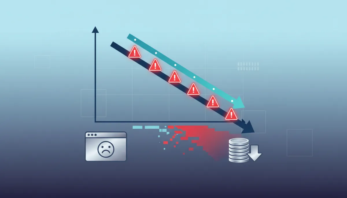
7 Signs Your Website Loses Revenue
Website Optimization, Bounce Rate, User Experience, Revenue Impact
7 High-Bounce Website Warning Signs Costing You Thousands in Lost Revenue
In less than three seconds, visitors decide whether your website deserves their attention or their back button. That split-second judgment determines whether you gain a qualified lead, a paying customer, and long-term revenue—or lose them to a competitor who invested more seriously in website optimization, user experience, and conversion strategy.
A persistently high bounce rate is not just a vanity metric—it is a direct signal that your website is leaking revenue. Visitors are arriving, taking one look, then abandoning your pages before engaging, exploring, or converting. For most businesses, that translates into thousands of dollars in lost opportunities every single month, regardless of how much you spend on ads, SEO, or social media campaigns.
When bounce rate spikes, the underlying cause is rarely a single issue. It is usually a combination of slow performance, poor mobile experience, confusing navigation, weak content structure, missing trust signals, ineffective calls-to-action, and analytics blind spots. Together, these problems erode user experience, undermine credibility, and quietly suffocate your revenue potential—often without clear internal warning bells until it is too late.
Warning Sign #1: Your Website Loads Like It’s Still on Dial-Up
In the era of high-speed connections, users are ruthless about load times. If your pages take more than three seconds to appear, a significant portion of visitors will abandon the session before your content even has a chance to load. Every extra second of delay compounds the damage—bounce rate rises, engagement collapses, and your acquisition costs skyrocket because you are paying for clicks that never convert into meaningful interactions.
Slow performance is not just a technical inconvenience; it is a direct attack on revenue. Paid traffic campaigns become dramatically less efficient when half of the visitors leave before the page renders. Organic search visibility suffers as well, because search engines now treat speed and core web vitals as ranking signals. Poor load times send a clear message to both users and algorithms—this site is not optimized, and it cannot be trusted to deliver a smooth experience.
💡 Performance Benchmark: Aim for sub–2 second load times for primary landing pages, especially those supporting paid campaigns and high-intent search terms.
From a website optimization standpoint, speed is foundational. Compress oversized images, eliminate render-blocking scripts, implement caching, and leverage a content delivery network. These changes are not cosmetic—they materially reduce bounce rate, protect your ad spend, and improve the first impression that shapes user experience across your entire digital presence.
Warning Sign #2: Your Mobile Experience Is an Afterthought
For most industries, mobile traffic now exceeds desktop—yet many business websites still treat mobile optimization as a secondary concern. Pinch-to-zoom layouts, tiny buttons, overlapping elements, and broken forms are all red flags that your site was designed for a desktop era that no longer exists. When visitors encounter friction on a small screen, they do not complain, they simply bounce and move on to a competitor whose experience respects their time and device constraints.
High mobile bounce rates are a clear indicator that your responsive design is not truly responsive. Text may be difficult to read, navigation may require excessive scrolling, and key calls-to-action may fall below the fold. Each of these issues chips away at user experience, undermines trust, and reduces the likelihood that a visitor will complete a form, call your team, or complete a purchase. In many cases, the mobile version of your site is quietly cutting your revenue potential in half.
💡 Mobile-First Imperative: Design critical pages from a mobile-first perspective—then scale up to desktop, not the other way around.
To protect revenue and reduce bounce rate, prioritize mobile usability testing. Review your analytics by device category, isolate high-traffic mobile landing pages, and evaluate them on an actual phone, not just a resized desktop browser. When you treat mobile experience as a core business asset—not an afterthought—you convert more visitors, capture more leads, and close the gap between traffic volume and revenue performance.
Warning Sign #3: Your Navigation Is a Labyrinth, Not a Highway
Effective navigation functions like a well-marked highway—clear, direct, and predictable. Visitors should be able to understand where they are, where they can go next, and how to reach a desired outcome within one or two clicks. When navigation becomes a maze of ambiguous labels, buried pages, and confusing menus, users quickly feel lost. That confusion manifests as backtracking, random clicking, and ultimately, a frustrated exit that inflates your bounce rate and erodes your credibility.
Poor navigation has a measurable revenue impact. Prospects who cannot quickly find pricing, service descriptions, case studies, or contact options rarely convert. Sales teams feel the downstream effect as well—fewer qualified inquiries, more time spent clarifying basic information, and longer sales cycles. Internally, you may interpret this as “low website performance” or “weak lead quality,” when the real culprit is a structure that forces visitors to do all the work.

Clear navigation and focused journeys consistently reduce bounce rate and raise conversion value.
From a user experience standpoint, navigation should mirror how your ideal customer thinks about your offerings. Group related services logically, use plain-language labels, and highlight the most commercially important paths—such as “Services,” “Pricing,” “Case Studies,” and “Contact.” When visitors can effortlessly move from curiosity to clarity to action, your bounce rate falls, your engagement metrics rise, and your website begins to function as an efficient revenue engine instead of a digital brochure.
Warning Sign #4: Your Content Fails the “F-Pattern” Test
Eye-tracking research shows that visitors rarely read web pages line by line—they scan in predictable patterns, most commonly in an “F” shape. They focus on the top headline, skim the first few lines, glance down the left side for cues, then selectively read across where something catches their interest. If your content ignores this behavior, you force readers to work harder than they are willing to work, and they respond with the simplest action possible—bouncing away to a site that communicates more clearly.
Dense paragraphs, vague headlines, and walls of unformatted text are all bounce-rate accelerants. They obscure your value proposition, bury key benefits, and make it difficult for decision-makers to quickly understand why your solution deserves a deeper look. In a business environment where time is scarce and alternatives are abundant, unclear content is indistinguishable from a weak offering. Visitors equate poor communication with poor execution—and they take their budgets elsewhere.
💡 Content Structure Principle: Use descriptive headings, short paragraphs, bullet lists, and clear subheadings to guide scanners toward your most important points and calls-to-action.
Optimizing content for the F-pattern is not about dumbing things down—it is about respecting how busy professionals consume information. When your pages are structured for scanning, visitors grasp your key messages faster, feel more confident in your expertise, and are far more likely to click deeper into your site. The result is a tangible reduction in bounce rate, stronger engagement metrics, and a measurable uplift in lead volume and revenue opportunities.
Warning Sign #5: Your Website Triggers Trust Alarms
Trust is the currency of digital business. In the absence of face-to-face interaction, visitors rely entirely on what they see and feel during their first seconds on your site. Outdated design, inconsistent branding, broken links, generic stock photos, missing security indicators, and thin company information all trigger subtle but powerful trust alarms. Prospects may not consciously articulate the problem—but their behavior is clear. They hesitate, they question, and then they leave, driving bounce rate up and revenue down.
These trust gaps have an outsized impact on revenue impact because they disproportionately affect high-intent visitors—the ones closest to a buying decision. A CFO researching vendors, a director shortlisting partners, or a consumer ready to purchase will not risk their budget or reputation on a site that feels outdated or insecure. They will choose the competitor whose website signals professionalism, stability, and credibility at every touchpoint, even if the underlying offering is comparable or weaker.
💡 Trust Signal Checklist: Prominent contact details, up-to-date design, case studies, testimonials, certifications, secure payment icons, and clear privacy policies are no longer optional—they are essential.
Strengthening trust is a core element of website optimization. When visitors feel confident that your business is legitimate, capable, and secure, they stay longer, explore more pages, and are more willing to share their data or complete a transaction. That shift in behavior lowers bounce rate, increases average session value, and compounds over time into significantly higher revenue per visitor.
Warning Sign #6: Your Call-to-Action Strategy Is Nonexistent
A website without a deliberate call-to-action strategy is like a retail store without checkout counters—people may browse, but very few will buy. If your pages end without a clear next step, if your buttons are vague or buried, or if every section competes for attention with conflicting offers, you are effectively instructing visitors to leave. The result is a high bounce rate, low conversion rate, and a misleading belief that “web traffic does not perform” when the real problem is strategic, not volumetric.
Calls-to-action must be visible, specific, and aligned with the visitor’s stage in the buying journey. A first-time visitor may be ready to download a guide or request a demo, while a returning prospect may be prepared to schedule a consultation or start a trial. When your CTAs are generic—“Learn More,” “Submit,” “Click Here”—or when they are scattered inconsistently across the page, you create friction at the exact moment when momentum should be highest. That friction translates directly into lost revenue opportunities.
💡 CTA Best Practice: Assign every key page a primary conversion goal, support it with one or two secondary options, and remove distractions that compete with those actions.
When your call-to-action strategy is intentional and tested, bounce rates decline because visitors have a clear path forward. They know what to do next, why it matters, and what to expect after they act. Over time, this clarity compounds into higher lead volume, improved sales efficiency, and a far stronger connection between website traffic and tangible revenue outcomes.
Warning Sign #7: Your Analytics Are Blind Spots, Not Insights
The most dangerous high-bounce warning sign is the one you cannot see—insufficient analytics. Without accurate tracking, you are operating in the dark. You may know your overall traffic and a rough bounce rate, but you lack the granular insight necessary to diagnose why visitors leave, which segments are underperforming, and where revenue is silently slipping away. In this environment, decisions are driven by opinion, not data, and website optimization becomes guesswork instead of a disciplined process.
Common issues include unconfigured goals, missing event tracking, misaligned conversion definitions, and a lack of segmentation by device, channel, or landing page. When these blind spots persist, you cannot accurately tie bounce rate to revenue impact. You might invest heavily in redesigns, content, or advertising without realizing that a single broken form, misaligned message, or slow mobile page is responsible for the majority of your lost opportunities. The result is wasted budget and stalled growth, even as top-line traffic appears healthy.
💡 Analytics Foundation: Configure clear conversion goals, map key user journeys, and review bounce rate by landing page, device type, and traffic source at least monthly.
Robust analytics turn bounce rate from a frustrating vanity metric into a powerful optimization signal. When you can see exactly where visitors drop off—and correlate that behavior with revenue—you can prioritize high-impact fixes, validate improvements, and build a website that continuously learns, adapts, and performs at a higher level quarter after quarter.
Self-Diagnosis: Is Your Website Suffering From the Bounce Rate Disease?
Before you can treat a high-bounce website, you need a clear diagnosis. Start by reviewing your analytics with a critical eye. Which landing pages attract the most traffic, and what are their individual bounce rates? How do those metrics differ between mobile and desktop? Are visitors spending time on your site but failing to convert, or leaving almost immediately after arrival? Each of these patterns tells a different story about user experience and revenue impact, and each demands a specific response.
Next, walk through your website as if you were a first-time visitor with a specific objective—requesting a quote, booking a consultation, comparing plans, or purchasing a product. Time how long it takes to accomplish that goal, and note every point of friction, confusion, or delay. Load the same pages on your phone over a cellular connection, not just Wi‑Fi. If you find yourself hesitating, scrolling aimlessly, or questioning your next step, your actual prospects are experiencing the same friction—and many are choosing not to push through it.
💡 Quick Diagnostic Questions: Is your site fast on mobile, easy to navigate, clear in its messaging, trustworthy in its design, and firm in its calls-to-action? If you hesitate on any of these, your bounce rate is almost certainly higher than it should be.
Finally, connect your website performance to financial outcomes. Estimate the value of a lead or sale, then calculate how many additional conversions you would gain by reducing bounce rate on key pages by even five or ten percentage points. For most businesses, the numbers are compelling—small improvements in user experience and website optimization translate into substantial increases in revenue without increasing traffic or advertising spend.
The Path Forward: From Bounce to Conversion
The good news is that high bounce rate is not a permanent condition—it is a symptom of specific, solvable issues. When you address performance, mobile experience, navigation, content structure, trust signals, calls-to-action, and analytics in a coordinated way, you transform your website from a passive brochure into an active revenue-generating asset. The process requires rigor, but it does not require guesswork. With the right data and a clear strategy, you can systematically remove friction and convert more of your existing traffic into measurable business outcomes.
Start with the highest-leverage opportunities. Identify your most valuable landing pages—the ones supporting paid campaigns, high-intent search terms, or core service offerings. Audit each against the seven warning signs outlined above. Where are you losing visitors before the page loads? Where does mobile experience break down? Where is navigation unclear, messaging dense, or trust weak? Where are calls-to-action missing, and where is analytics failing to capture the full picture? Each identified issue is an opportunity to reclaim lost revenue.
💡 Optimization Mindset: Treat your website as a living system that demands ongoing refinement—not a one-time project. Continuous, data-driven improvements compound over time into a durable competitive advantage.
As you implement changes, monitor the impact closely. Track bounce rate, time on page, pages per session, and conversion rate for each optimized area. Share these metrics with leadership and revenue teams, not just marketing or IT. When the organization sees a direct connection between improved user experience and financial performance, website optimization moves from a technical initiative to a strategic priority—where it belongs.
Take Action Now: Stop Letting High Bounce Rates Drain Your Revenue
While you are reading this, potential customers are landing on your website, making instant decisions, and either moving one step closer to doing business with you—or disappearing into a competitor’s funnel. Every day you postpone addressing high bounce rates is another day of avoidable revenue leakage. The market will not slow down while your site catches up. Competitors who invest aggressively in user experience and optimization are already converting a higher percentage of the same audience you are paying to reach.
The path forward is clear. Audit your website against the seven warning signs, quantify the revenue impact of your current bounce rate, and commit to a structured optimization plan. Whether you manage improvements internally or partner with specialists, the objective remains the same—turn your website into a fast, intuitive, trustworthy, and conversion-focused experience that respects your visitors’ time and maximizes the return on every marketing dollar you invest.
📌 Key Takeaway: You do not need more traffic to grow—you need to convert more of the traffic you already have. Reducing bounce rate through strategic website optimization is one of the most direct, controllable ways to increase revenue in the next 90 days.
Treat your website as a core business asset, not a static marketing expense. When you align performance, design, content, trust, and analytics around a single objective—delivering a superior user experience that drives measurable revenue—bounce rate stops being a silent threat and becomes a powerful indicator that you are on the right track.
