
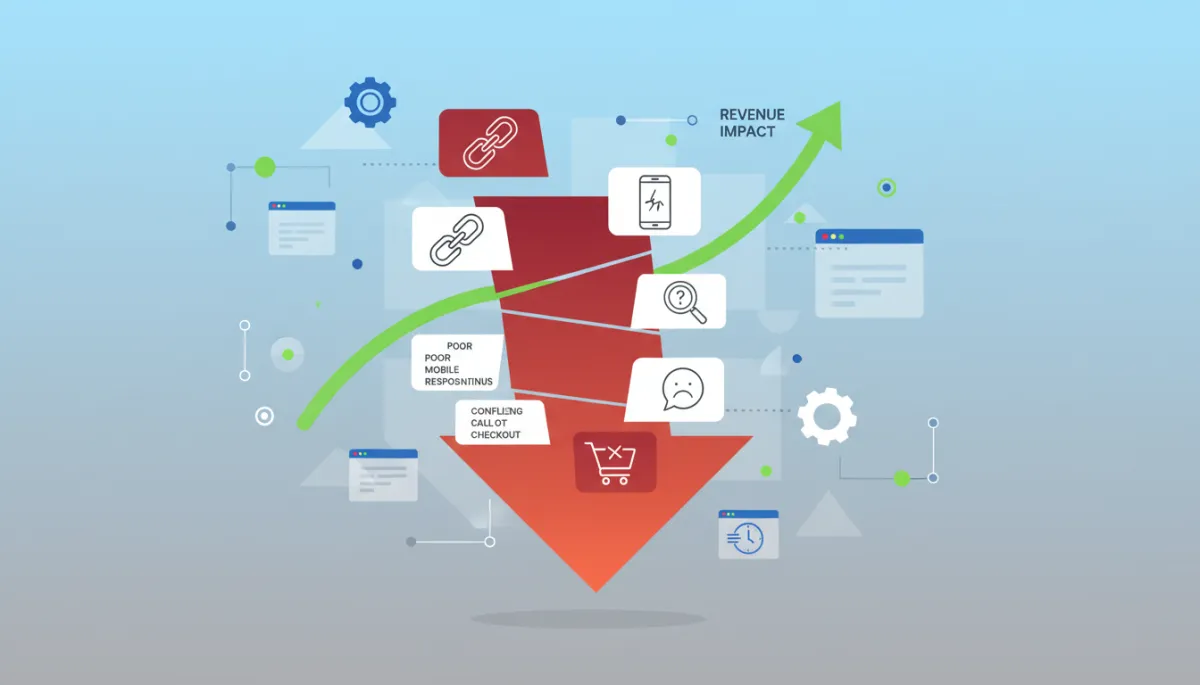
Identify High-Bounce Website Warning Signs
Website Optimization, Bounce Rate, Revenue Impact, User Experience
The High-Bounce Website Warning Signs Every Business Owner Must Know
In less than three seconds, your website either earns a serious buyer or loses them—possibly forever. High bounce rates are not “just a metric”; they are silent profit leaks that quietly drain campaigns, weaken sales pipelines, and undermine every dollar you invest in marketing.
When bounce rate climbs above 60–70% on key landing pages, it is almost always a symptom of deeper website optimization failures—slow speed, weak user experience, confusing navigation, or a lack of clear next steps. Each one chips away at trust and, ultimately, revenue. The good news: the warning signs are measurable, predictable, and fixable if you know what to look for.
7 High-Bounce Website Warning Signs Costing You Thousands in Lost Revenue
Across hundreds of business websites we’ve reviewed, the same seven patterns show up again and again. They look different on the surface, but they all share one outcome—visitors leave before they ever become leads, inquiries, or customers. Use the following warning signs as a diagnostic checklist for your own site.
Warning Sign #1: Your Website Loads Like It’s Still on Dial-Up
Page speed is the first impression of your user experience. If your site takes more than three seconds to load, 40% of visitors will abandon it—many before they even see your headline. On mobile, the tolerance is even lower. Every additional second of delay can reduce conversions by up to 7–10%. Slow sites don’t just frustrate visitors; they train them to click the back button automatically.
From a revenue perspective, a slow site multiplies waste across your entire marketing ecosystem. You pay for traffic through ads, SEO, social, and email—then lose a large percentage of that investment before visitors even evaluate your offer. A high bounce rate driven by speed issues is one of the most expensive forms of marketing inefficiency, yet it’s often the easiest to fix with disciplined website optimization.
💡 Speed Benchmark: Aim for under 2 seconds on desktop and under 3 seconds on mobile for your primary revenue pages.
Warning Sign #2: Your Mobile Experience Is an Afterthought
More than 60% of web traffic now comes from mobile devices, yet many business sites are still designed from a desktop-first mindset. The result—tiny text, cramped layouts, buttons that are hard to tap, and forms that feel impossible to complete on a phone. When mobile visitors have to pinch, zoom, or scroll sideways, they don’t adapt—they leave. High mobile bounce rates are almost always tied to poor responsive design and neglected mobile testing.
The revenue impact is direct. If 60% of your traffic is mobile and your mobile bounce rate is 20 percentage points higher than desktop, you are giving away a massive portion of potential leads and sales. A mobile-optimized experience—fast loading, legible typography, clear calls-to-action, and frictionless forms—turns that same traffic into a predictable source of pipeline growth instead of a revolving door.
💡 Mobile Priority: Design your most important pages for mobile first, then adapt upward to tablet and desktop.
Warning Sign #3: Your Navigation Is a Labyrinth, Not a Highway
Navigation is the structural backbone of user experience. It should feel like a clearly marked highway—direct, predictable, and easy to follow. Instead, many business websites resemble a maze: overloaded menus, vague labels, buried pages, and multiple paths to the same destination. When visitors cannot instantly see where to go next, they default to the simplest option—exiting the site entirely, which pushes bounce rate higher and session duration lower.
Confusing navigation quietly erodes revenue. Prospects who are ready to buy or book a consultation cannot find pricing, service details, or contact options. Existing customers can’t locate support resources or account information. Each friction point is a missed opportunity to move someone deeper into your funnel. Clean, intuitive navigation—limited top-level options, descriptive labels, and a logical content hierarchy—keeps visitors engaged long enough to convert.
💡 Navigation Rule: If a first-time visitor cannot find your primary offer in under 5 seconds, your structure needs work.
Warning Sign #4: Your Content Fails the “F-Pattern” Test
Years of eye-tracking studies show that visitors rarely read web pages line by line—they scan, usually in an F-shaped pattern. They focus on the top of the page, the left side, and a few horizontal sections as they scroll. Content that ignores this reality—dense paragraphs, weak headings, no visual hierarchy—forces people to work too hard to understand what you offer. When cognitive load rises, so does bounce rate.
From a revenue standpoint, poor content structure is lethal. If your headlines do not immediately communicate value, if your subheadings do not answer key questions, and if your copy buries the benefits beneath jargon, visitors will not stick around long enough to grasp your solution. Effective website optimization respects scanning behavior—clear headings, short paragraphs, bullet lists, and prominent value statements that guide the eye and reduce friction in the decision process.
💡 Content Test: A busy decision-maker should understand who you serve, what you do, and why it matters in under 10 seconds.
Warning Sign #5: Your Website Triggers Trust Alarms
Trust is the invisible currency of online business. Without it, even the best offer fails. Visitors make rapid trust judgments based on design quality, visual consistency, and the presence—or absence—of credibility signals. Outdated layouts, broken links, inconsistent branding, stock photos that feel generic, or missing contact details all send subtle warnings: “This business may not be reliable.” When those alarms fire, people leave, and your bounce rate climbs in parallel with lost opportunities.
The revenue impact is measurable. Sites that demonstrate strong trust signals—testimonials, case studies, security badges, clear policies, and professional design—regularly see conversion lifts of 20–40%. Conversely, trust gaps reduce both lead volume and lead quality. Prospects who do convert may do so hesitantly, with lower average order values and higher churn. Investing in a trustworthy, credible user experience is not cosmetic; it is a direct lever on revenue performance.

Strengthening visible trust signals can raise on-site conversion rates by 20–40%.
Warning Sign #6: Your Call-to-Action Strategy Is Nonexistent
A website without clear calls-to-action (CTAs) is like a retail store with no checkout counter—people browse, then walk out. Many business sites bury or dilute their CTAs: buttons that blend into the background, vague labels like “Learn More,” or pages that end abruptly with no next step. When visitors are not told explicitly what to do, they rarely guess correctly. The result is a high bounce rate, low lead volume, and a sales team starved of qualified conversations.
Strategic CTAs guide behavior and align directly with revenue goals—book a consultation, request a quote, start a free trial, download a buying guide. Effective websites use a hierarchy of CTAs: one primary action per page, supported by secondary, lower-commitment options for visitors who are not yet ready to talk to sales. When your CTAs are visible, specific, and repeated at logical intervals, bounce rate falls and conversion rate climbs, often by double-digit percentages.
💡 CTA Standard: Every meaningful page should answer “What should I do next?” with a single, obvious action.
Warning Sign #7: Your Analytics Are Blind Spots, Not Insights
The most dangerous warning sign is the one you cannot see—poor analytics. Many sites either lack proper tracking or collect data without turning it into decisions. Missing events, untagged buttons, broken goals, or incomplete funnel tracking create blind spots. You might see a high bounce rate on a key page but have no idea which element is causing the exits. Without clear insight into behavior, optimization becomes guesswork, and guesswork is expensive.
Robust analytics transform your website from a static brochure into a measurable sales asset. When you can see which traffic sources bounce at 75%, which CTAs are clicked, which sections visitors scroll past, and where they drop out of forms, you gain leverage. Each optimization—faster load times, stronger messaging, streamlined navigation—can be tied to concrete improvements in bounce rate and revenue. In a competitive market, businesses that measure precisely will consistently outperform those that operate on assumptions.
💡 Analytics Goal: Track every key action that contributes to revenue—form submissions, calls, downloads, sign-ups, and purchases.
Self-Diagnosis: Is Your Website Suffering From Bounce Rate Disease?
Before you can treat high bounce rates, you need a clear diagnosis. Use the following quick checks to evaluate your current performance. You do not need to be a technical expert—only disciplined and honest about what you see. Each step connects directly to website optimization, user experience, and revenue potential.
Check Your Analytics
Start with your analytics dashboard. Look at bounce rate for your top landing pages—the ones that receive the most traffic or drive the most revenue. For many industries, 40–60% is typical. Consistent numbers above 70% on these pages are a red flag. Also review average session duration and pages per session. Short sessions and single-page visits usually confirm that visitors are not finding what they need or are being blocked by performance issues.
Test Mobile Usability
Next, test your own site on multiple phones—both iOS and Android, different screen sizes, and real-world connection speeds. Navigate as if you were a new prospect: can you read the text without zooming, tap buttons easily, and complete a form without frustration? If you feel irritation at any point, your visitors are likely abandoning the experience even faster. Compare your mobile bounce rate to desktop; a gap of more than 15–20 percentage points signals a mobile user experience problem that needs immediate attention.
Time Your Loading Speed
Use tools such as Google PageSpeed Insights or GTmetrix to measure loading times for your homepage and key landing pages. Pay close attention to “Largest Contentful Paint” and time-to-interactive metrics. If you see numbers above 3 seconds, especially on mobile, you are losing a significant percentage of visitors before they evaluate your offer. Each second you shave off load time is a direct gain in user experience and revenue potential, often with no change in traffic volume.
Navigation Test
Ask three to five people who are not familiar with your business to complete simple tasks on your site—find pricing, locate a specific service, book a consultation, or access support. Time how long it takes them and record where they hesitate. If they get lost, misinterpret labels, or resort to the search bar for basic tasks, your navigation is likely contributing to higher bounce rates and lower conversions. Real users expose friction that analytics alone can’t fully explain.
Trust Signal Audit
Review your site as a skeptical buyer. Do you see real client logos, specific testimonials, case studies with measurable results, security badges, and clear contact information? Are your policies easy to find? Does the design feel current and consistent, or dated and neglected? The absence of trust signals does not just “look bad”—it drives up bounce rate and suppresses revenue because visitors hesitate to share data, book calls, or complete transactions with a brand they do not fully trust.
CTA Check
Finally, scan your key pages from top to bottom. Is there a clear, specific, visually distinct call-to-action above the fold? Is it repeated after major content sections? Does each CTA align with a concrete business outcome—consultation, quote, demo, purchase, or download? If visitors have to hunt for the next step or are presented with too many competing options, they will default to inaction. High bounce rates often reflect not a lack of interest, but a lack of direction.
The Path Forward: From Bounce to Conversion
High bounce rates are not a permanent condition; they are a performance signal. When you treat your website as a core revenue asset—not a static brochure—you can systematically reduce bounce and increase conversions. The process is straightforward: diagnose the biggest leaks, prioritize changes with the highest impact on user experience, and measure results with disciplined analytics. Incremental improvements of 10–20% in key metrics compound into significant revenue gains over a year.
Focus first on foundational website optimization: fast load times, mobile responsiveness, clean navigation, and trustworthy design. Then refine your content structure around how real buyers read and decide. Finally, align every page with clear, compelling calls-to-action and track how visitors respond. When you combine these elements, bounce rate stops being a liability and becomes a leading indicator of a healthy, conversion-focused digital presence.
📌 Key Takeaway: You do not need more traffic to grow revenue—you need more of your existing visitors to stay, trust, and act.
Take Action Now: Get Serious About Your Bounce Rate
As a business owner, you already invest heavily in attracting attention—advertising, content, events, referrals. Your website is where that attention is either converted into revenue or lost to competitors. A persistently high bounce rate is a warning you cannot afford to ignore. The companies that win in the next 12–24 months will be those that treat user experience, analytics, and optimization as ongoing disciplines, not one-time projects.
Commit to a structured review of your site at least quarterly. Monitor bounce rate by device, channel, and page. Run simple experiments—new headlines, faster pages, clearer CTAs—and measure the impact. Even modest improvements, such as reducing bounce by 10% on a high-traffic landing page, can translate into a meaningful increase in qualified leads and closed revenue. The data is already telling you where to act; your job is to listen and respond with intention.
What an Expert Bounce Rate Assessment Should Include
If you decide to bring in outside expertise, ensure the assessment goes beyond surface-level observations. A meaningful review should connect technical performance, design, content, and analytics back to business outcomes—lead volume, pipeline quality, and revenue growth. Insist on clear, prioritized recommendations rather than generic advice. At a minimum, a professional evaluation should cover the following areas.
Speed and performance testing across devices, browsers, and connection types, with specific actions to reduce load times.
Mobile usability review focused on readability, tap targets, forms, and conversion paths on smartphones and tablets.
Navigation and information architecture audit to simplify paths to core offers and reduce confusion.
Content and messaging analysis aligned with how buyers scan, evaluate risk, and compare options.
Trust signal evaluation to identify credibility gaps that may be suppressing conversions.
CTA and funnel mapping that traces how visitors move from first visit through to lead or purchase.
Analytics configuration review to ensure every key interaction that influences revenue is accurately tracked.
When these elements are assessed together, you gain a clear, data-backed roadmap for reducing bounce rate and improving the user experience in ways that directly support revenue growth. The objective is simple—turn more of the visitors you already have into buyers, not bouncers.
Final Word for Business Owners
High bounce rates are not a mystery; they are a management problem. They signal where your website is failing to meet the expectations of modern buyers—speed, clarity, trust, and ease. As a business leader, you do not need to master every technical detail, but you do need to demand measurable performance from your digital presence. Treat bounce rate as you would any critical financial metric: track it, question it, and improve it deliberately.
The businesses that thrive online are not always the ones with the biggest budgets—they are the ones that respect their visitors’ time, reduce friction at every step, and make it effortless to say “yes.” Start by addressing the seven warning signs outlined above. Every improvement you make to website optimization, bounce rate, revenue impact, and user experience compounds over time into a stronger, more resilient digital business.
