
The Psychology of Whitespace in Web Design
Web Design, UX, Visual Psychology
The Psychology of Whitespace: Why Less is More in Modern Web Design
Whitespace is far more than “empty space” on a page. Used strategically, it is one of the most powerful tools in modern web design—shaping aesthetics, guiding attention, improving user experience, and quietly lifting conversions and engagement. This in‑depth guide explores the psychology behind whitespace and how “less” can consistently deliver “more” for your digital products and websites.

What Is Whitespace Really?
In design, whitespace (also called negative space) refers to the areas of a layout that are intentionally left unmarked. It is not limited to the color white; it can be any background color, texture, or even a subtle gradient. What matters is that the space is visually quiet and free from competing elements.
Whitespace appears between lines of text, around images, in the margins of a page, between sections, and within interactive components like buttons and cards. It defines the breathing room of a design—how comfortable, focused, and readable an interface feels to the user. Far from being wasted space, whitespace is an active design element that influences perception and behavior at a deep psychological level.
The Psychology Behind Whitespace
1. Reducing Cognitive Load
Every element on a page demands a small portion of a user’s mental energy to process. When a layout is dense—crowded text, stacked buttons, multiple competing visuals—the brain must work harder to filter what matters from what does not. This mental effort is known as cognitive load, and high cognitive load often leads to frustration, confusion, and abandonment.
Whitespace counteracts this by simplifying visual input. Generous spacing around headings, paragraphs, and key actions gives the eye clear resting points. As a result, users can scan and understand content with less effort and make decisions more confidently. In psychological terms, whitespace supports processing fluency—the ease with which information is absorbed and interpreted—which is strongly linked to positive user judgments and trust.
2. Leveraging Gestalt Principles of Perception
Human perception follows certain predictable patterns, often described by the Gestalt principles. Whitespace plays a direct role in how these principles manifest in an interface. For example:
- Proximity: Elements placed closer together are perceived as related. Whitespace between groups of elements helps users understand which items belong together and which do not, without reading a single word of explanatory text.
- Figure–ground: Our brains separate objects (figure) from their background (ground). Consistent whitespace clarifies what is interactive (like buttons or links) and what is informational, reducing misclicks and confusion.
- Similarity: When elements share similar spacing, typography, or alignment, users perceive them as part of a system. Whitespace helps reinforce these patterns, making interfaces feel more intuitive and learnable.
By aligning whitespace with these perceptual rules, designers can guide users’ attention naturally, without resorting to aggressive visual cues or overwhelming color and motion. The experience feels calm, yet clearly directed.
3. Emotional Impact and Brand Perception
Design does not only communicate information; it also communicates emotion and brand personality. Whitespace is strongly associated with qualities such as sophistication, calm, confidence, and focus. Luxury brands, premium software products, and high-end professional services frequently rely on spacious layouts to convey a sense of quality and restraint: “We do not need to shout to be heard.”
Psychologically, users interpret visual simplicity as a sign of clarity and control. When a page feels uncluttered, visitors are more likely to assume that the brand is organized, trustworthy, and user‑centric. Conversely, cramped layouts may suggest disorganization, outdated practices, or a lack of attention to detail—even when the underlying product is strong. In this way, whitespace becomes a subtle but powerful reputational asset.
Aesthetics: Why Minimal Feels Modern and Refined
Aesthetics are often dismissed as “subjective,” yet consistent patterns emerge when people evaluate what looks modern, professional, or trustworthy. Across industries, contemporary web design trends lean toward clean typography, restrained color palettes, and generous whitespace. This is not a passing fashion; it reflects deeper aesthetic and psychological preferences shaped by our daily exposure to digital interfaces.
Clarity as a Visual Value
At the heart of modern aesthetics is clarity. Users want to understand at a glance what a website offers, what is important, and what they should do next. Whitespace supports this by:
- Giving headlines and key messages room to stand out without competition from surrounding clutter.
- Allowing imagery to be showcased without being crowded by text and icons.
- Creating a visual rhythm that feels deliberate and composed, rather than chaotic or accidental.
When users describe a site as “beautiful” or “elegant,” they are often responding to this sense of clarity. Whitespace gives each element a clear role and reduces visual noise, allowing the design’s core message and identity to shine through.
Visual Hierarchy and Focus
A well‑designed page guides the eye in a logical sequence: headline, key benefit, supporting copy, primary call to action. Whitespace is essential for building this visual hierarchy. By adjusting spacing between elements, designers can subtly indicate what should be noticed first, second, and third—without relying solely on size or color contrasts.
For example, adding extra space above a headline and slightly tighter space between the headline and its supporting paragraph visually connects those two elements, while separating them from the content above. Similarly, generous padding around a primary button makes it feel more important and more inviting to click. The result is an interface that feels visually balanced and easy to follow—an aesthetic quality users notice even if they cannot articulate why it works so well.
The Luxury of Space
In physical environments, open space often signals exclusivity and intentionality. Think of a boutique gallery with a single piece of art on a large wall, or a high‑end store with only a few carefully arranged items on display. The same principle applies online. When a digital interface is not crammed edge‑to‑edge with content, it suggests that the brand is confident enough to focus on what truly matters.
This perceived “luxury of space” can be particularly effective for professional services, premium subscriptions, and products where trust and perceived value are crucial. Whitespace tells users: “We respect your time and attention. We will not overwhelm you.” That message alone can elevate a brand’s aesthetic appeal and perceived quality.

Spacious layouts highlight the most important message and make calls to action feel effortless to notice.
User Experience: How Whitespace Shapes Behavior and Comfort
Reading Comfort and Comprehension
Long blocks of tightly packed text are difficult to read on any screen, but especially on mobile devices. Adequate line spacing, paragraph spacing, and margins dramatically improve reading comfort. Users can track lines more easily, avoid losing their place, and process content at a more natural pace. This leads directly to better comprehension and longer on‑page engagement times.
Numerous usability studies have shown that increasing line spacing and margins—even slightly—can increase reading speed and retention. Whitespace around text also reduces visual stress, which is particularly important for users who spend many hours a day reading on screens or who may have visual or cognitive impairments. In short, whitespace is an accessibility ally as much as it is a design choice.
Navigation and Wayfinding
Users rarely read a website from top to bottom like a printed page. Instead, they scan, searching for cues that tell them where to go next. Whitespace is a critical part of this navigational system. Clear spacing between sections, generous padding around navigation menus, and distinct separation between primary and secondary actions all help users orient themselves quickly and move with confidence through the experience.
When navigation elements are cramped or visually merged with surrounding content, users must work harder to locate them. This increases friction and can lead to missed opportunities—such as failing to discover a key feature or resource. By contrast, whitespace acts like signage in a physical space—it clarifies pathways and reduces the mental effort required to move from point A to point B.
Touch Targets and Mobile Friendliness
On touch devices, whitespace is not only visual; it is functional. Buttons, links, and interactive elements need sufficient space around them to be tapped comfortably without accidental clicks. This is especially important for primary calls to action, menu items, and form fields. Generous padding and spacing improve tap accuracy, reduce frustration, and create a smoother, more forgiving experience for users on the move.
From a UX standpoint, whitespace around interactive elements is as critical as the elements themselves. A beautifully designed button that is too close to other links or text can quickly become a usability problem. Thoughtful negative space transforms that same button into a confident, easy‑to‑use control that feels made for touch.
Perceived Effort and Task Completion
When users encounter a dense form or a crowded interface, they often overestimate the effort required to complete a task. This perception alone can deter them from starting. Whitespace helps break complex tasks into visually manageable segments. Grouping related fields, adding space between steps, and using clear section breaks all reduce the perceived complexity of a process, even if the actual number of steps remains the same.
This concept—perceived effort—is crucial in forms, checkouts, onboarding flows, and configuration interfaces. Users are more likely to complete a process when it looks simple and approachable. By using whitespace to create that impression, designers can significantly improve task completion rates and overall satisfaction without changing the underlying functionality at all.
Visual Breathing Room: Designing for Calm and Focus
The phrase visual breathing room captures what users often crave but rarely articulate: interfaces that feel calm, open, and unhurried. In an environment where people are constantly bombarded with notifications, feeds, and pop‑ups, a layout that offers space and stillness becomes a relief. Whitespace is the primary way to create that sense of calm focus in web design.
Space as a Signal of Priority
Visual breathing room does not mean empty pages. Rather, it means allocating enough space so that the most important elements can be appreciated without distraction. When a hero section features a concise headline, a short supporting sentence, and a single call‑to‑action button surrounded by generous whitespace, users understand immediately where to focus their attention and what to do next. The space around those elements acts as a spotlight, signaling that this is the core message of the page.
Reducing Visual Fatigue
Visual fatigue arises when the eye is forced to constantly adjust to dense, competing stimuli. Cluttered layouts with minimal whitespace demand continuous micro‑decisions about where to look, what to ignore, and how to interpret overlapping signals. Over time, this leads to discomfort and a desire to disengage. Visual breathing room, by contrast, offers periods of rest within the layout—spaces where the eye can pause before moving on to the next piece of information.
This is particularly important on content‑heavy pages such as blogs, resource libraries, dashboards, or documentation. Strategic whitespace between sections, around charts, and within sidebars prevents the interface from feeling overwhelming. Users can stay engaged longer and are more likely to explore additional content when they do not feel visually exhausted after a few seconds.
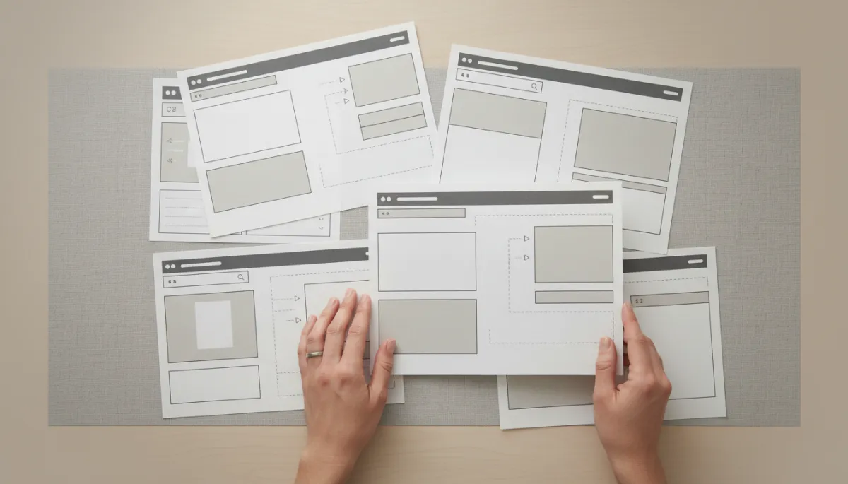
Planning whitespace at the wireframe stage ensures every page has enough visual breathing room before details are added.
Creating Rhythm and Flow
Just as music relies on pauses as much as notes, effective layouts rely on spaces as much as content. Whitespace introduces a visual rhythm to the page: larger gaps between major sections, smaller gaps within related content, and subtle micro‑spacing around icons and labels. This rhythm guides users through the experience in a controlled, almost narrative way—building anticipation, delivering key information, and then pausing before the next section begins.
When rhythm is missing—when everything is packed tightly with identical spacing—the page feels monotonous and harder to parse. Visual breathing room introduces contrast and pacing, making the experience more engaging without adding any extra content or features. It is a purely spatial improvement that yields significant experiential benefits.
How Whitespace Impacts Conversion and Engagement
While whitespace is often discussed in terms of aesthetics and comfort, it also has measurable effects on conversion rates and user engagement. When visitors can understand a value proposition quickly, navigate without friction, and focus on a clear call to action, they are much more likely to take the next step—whether that is signing up, purchasing, booking a demo, or reading another article.
Clearer Calls to Action, Higher Click‑Through Rates
One of the most direct ways whitespace affects conversion is by clarifying calls to action (CTAs). A button that is visually crowded by text, images, or secondary links competes for attention. Users may miss it entirely or hesitate because it does not stand out as the obvious next step. By surrounding CTAs with generous whitespace—above, below, and on both sides—designers create a focal point that naturally attracts the eye.
A/B tests across many industries consistently show that simplifying layouts and increasing spacing around key actions can lift click‑through rates. Sometimes, the improvement comes not from changing the button color or wording but from giving that button room to be seen. In conversion optimization, whitespace is often an underused lever with substantial upside.
Lower Bounce Rates Through Instant Clarity
Visitors form an impression of a website within seconds. If the initial view is cluttered, confusing, or visually overwhelming, many will leave before exploring further. Whitespace helps deliver instant clarity by presenting a focused, digestible snapshot of what the site offers and why it matters. A clean hero section, a concise headline, and a small amount of supporting text—surrounded by ample space—give users confidence that they are in the right place and that the site will respect their time.
This clarity directly influences bounce rates. Users who understand the value proposition quickly are more likely to scroll, click, or read on. Over time, this increased engagement signals to search engines that the content is relevant and valuable, which can further improve organic visibility and traffic—creating a positive feedback loop between whitespace, engagement, and discoverability.
Enhanced Trust and Willingness to Convert
Conversion is not only about usability; it is also about trust. Users are more likely to share personal information or payment details if they feel the brand is professional and reliable. Whitespace contributes to this perception by making interfaces appear considered, orderly, and aligned with modern design standards. A cluttered checkout form can raise subconscious doubts about security or legitimacy, whereas a clean, spacious layout signals competence and care.
This effect is especially important for first‑time visitors who have not yet built a relationship with the brand. The visual experience becomes a proxy for the organization’s quality. When the interface feels calm and controlled, users are more comfortable taking meaningful actions—subscribing to a newsletter, starting a free trial, or completing a purchase.
Supporting Deeper Content Engagement
For content‑driven sites—blogs, knowledge bases, learning platforms, reports—engagement is often measured by time on page, scroll depth, and downstream actions such as downloads or shares. Whitespace supports deeper engagement by making long‑form content feel approachable rather than intimidating. Breaking text into shorter paragraphs, using generous margins, and spacing out subheadings all encourage users to keep reading instead of skimming and leaving.
When content is presented with care and breathing room, it signals that the information itself is valuable. Users are more likely to invest their time and attention, which in turn increases the likelihood that they will take further actions—exploring related articles, subscribing, or contacting your team for more information.
Practical Ways to Use Whitespace in Modern Web Design
1. Start with Content, Then Add Space Intentionally
Effective whitespace begins with clarity about what matters most. Before adjusting margins or padding, identify the core elements of each page: primary message, supporting copy, key visuals, and main actions. Once these are defined, design the layout so that each of these elements has room to breathe, and supporting details do not compete for attention. This content‑first approach prevents whitespace from feeling random or decorative; instead, it becomes a deliberate tool for prioritization.
2. Use Consistent Spacing Systems
Consistency is key to a coherent user experience. Many modern design teams rely on spacing scales—such as 4‑, 8‑, or 10‑pixel increments—to ensure that margins, padding, and gaps follow a predictable pattern. This systematic approach to whitespace:
- Simplifies collaboration between designers and developers.
- Ensures that similar components feel related across the site.
- Prevents ad‑hoc spacing decisions that can lead to visual inconsistency.
By defining a spacing scale and documenting it in your design system, you make it easier to maintain a balanced, breathable interface as your product evolves.
3. Prioritize Whitespace in Key Conversion Areas
Not every part of a website needs the same degree of openness. Focus your most generous whitespace on high‑impact areas such as hero sections, pricing tables, checkout flows, and lead‑capture forms. In these contexts, clarity and ease are directly tied to business outcomes. Removing unnecessary elements, simplifying copy, and increasing spacing can yield disproportionate gains in conversions and sign‑ups compared to similar adjustments elsewhere on the site.
4. Test Perceptions, Not Just Layouts
Because whitespace influences both behavior and emotion, it is useful to test not only what users do, but how they feel. When running usability studies or surveys, ask questions such as:
- “How easy was it to understand what this page is about?”
- “Did anything feel overwhelming or crowded?”
- “If you could change one thing to make this page more comfortable to use, what would it be?”
Users’ answers often point directly to spacing issues, even if they do not use the word “whitespace.” Combining qualitative feedback with quantitative metrics—such as click‑through rates, scroll depth, and completion rates—can help you fine‑tune whitespace decisions with confidence.
5. Resist the Urge to Fill Every Gap
Stakeholders sometimes see whitespace as unused real estate that could be filled with extra promotions, links, or announcements. While it is important to surface relevant content, overloading every open area undermines the very clarity that drives engagement and conversion. A useful rule of thumb is: if adding an element does not support a specific user goal or clarify the experience, it is better to leave that space open.
Educating teams about the strategic role of whitespace—backed by data and examples—can reduce pressure to fill every gap. Over time, organizations that embrace “less is more” often see stronger results than those that try to say everything at once.
Common Misconceptions About Whitespace
“Whitespace Is Wasted Space”
Perhaps the most persistent misconception is that whitespace represents missed opportunities to show more content or promotions. In reality, the opposite is often true. By trying to fit more into every screen, brands dilute the impact of each individual message. Whitespace ensures that the most important elements are noticed, understood, and acted upon—leading to better outcomes than a crowded layout ever could.
“Whitespace Only Matters for Minimalist Brands”
While minimalist brands often showcase whitespace dramatically, every brand can benefit from appropriate spacing. Even bold, colorful, or playful identities need breathing room to remain legible and enjoyable. Whitespace does not require a monochrome palette or ultra‑thin typography; it simply requires thoughtful decisions about how much visual information to present at once, and how to separate it so users can navigate comfortably.
“More Content on the Screen Is Always Better”
It can be tempting to assume that users prefer to see as much as possible without scrolling. However, cramming content into a single viewport often makes it harder to understand and act upon. Users are comfortable scrolling—especially on mobile—if they feel guided and if each screenful of content is easy to parse. Whitespace helps create that comfort. In many cases, spreading content over a slightly longer page with more breathing room leads to higher engagement than compressing everything into a single dense view.
Bringing It All Together: Less Is More, When Less Is Intentional
The psychology of whitespace reveals a consistent theme: what we leave out is just as important as what we put in. When used intentionally, whitespace enhances aesthetics, elevates user experience, creates visual breathing room, and measurably improves conversion and engagement. It reduces cognitive load, clarifies hierarchy, and communicates confidence and quality—all without adding a single extra feature or line of copy.
For modern web design teams, embracing “less is more” does not mean oversimplifying or stripping away personality. It means curating content carefully, prioritizing clarity over clutter, and giving each element the space it needs to do its job well. Whether you are designing a landing page, a product dashboard, or a content hub, thoughtful whitespace is one of the most reliable ways to create experiences that feel modern, human, and effective.
As you evaluate your own site or upcoming redesign, look beyond color and typography and ask: Where can we create more space for users to think? Often, the most powerful improvement you can make is not adding something new—but removing what is unnecessary and letting the remaining elements breathe.
SEO Title: The Psychology of Whitespace in Web Design: How Less Creates More Conversions
Meta Description: Discover how the psychology of whitespace shapes modern web design. Learn how visual breathing room improves aesthetics, user experience, engagement, and conversion rates across your digital experiences.
Meta Keywords: whitespace in web design, negative space, visual breathing room, UX design, web design psychology, conversion optimization, modern website aesthetics, user engagement
